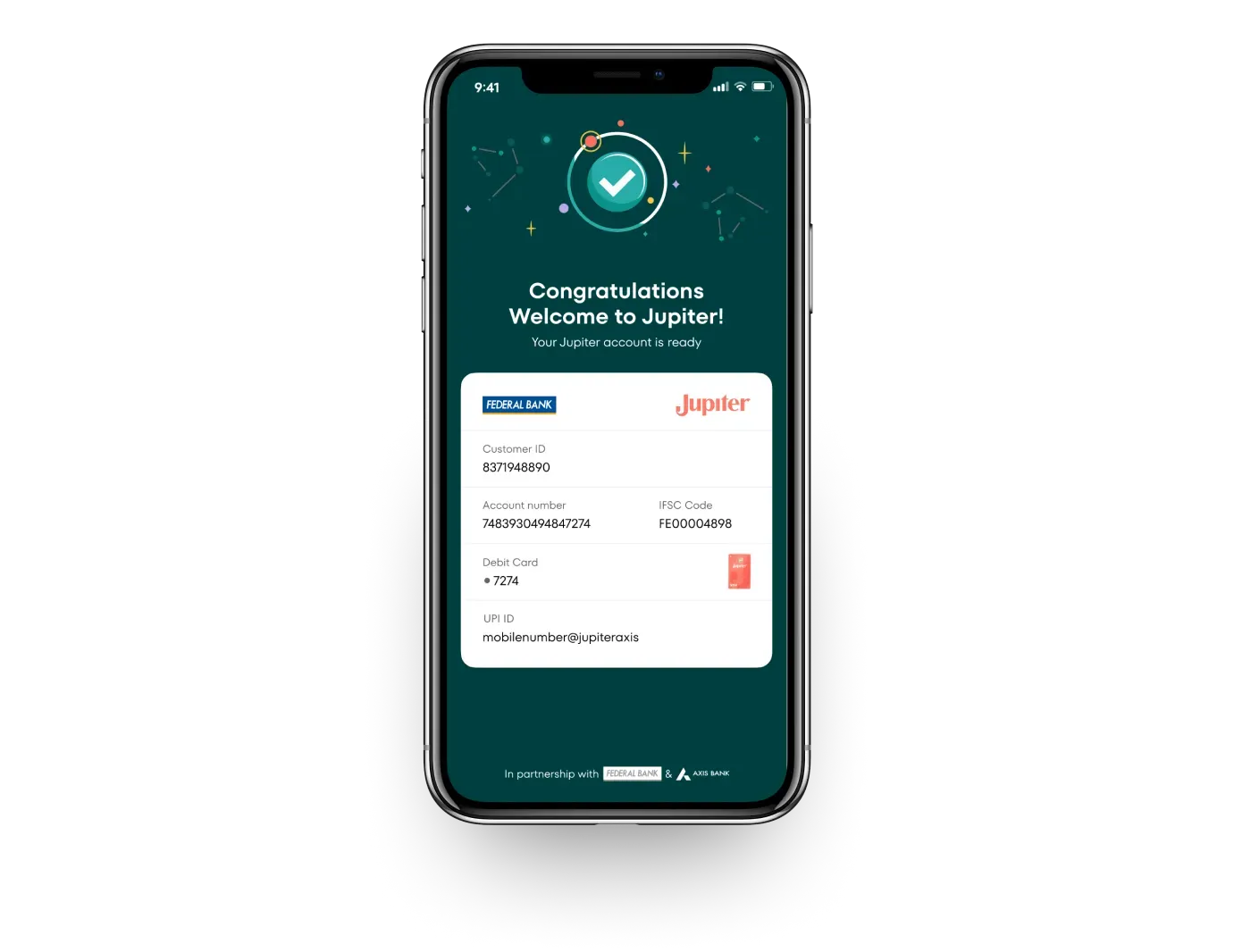
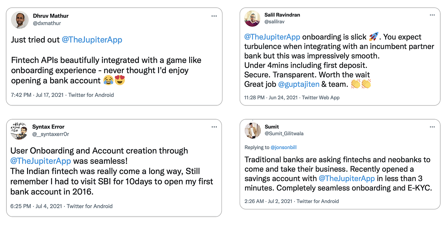
The challenge: to make onboarding easy to understand, frictionless, and fun. It had to be all of that, and still follow bank guidelines. Here’s how we designed a smooth account opening experience at Jupiter, a 100% digital banking experience built in partnership with Federal Bank.
Warning: reading any further may make you want to upgrade to Jupiter right away. :)
How it started
Instant money transfer has been around for a while. India was already ahead of the curve with technologies like IMPS and NEFT, and pushed the boundaries further with UPI.
But what about instant account opening? Indian banks have many verification processes like KYC, HKYC, FKYC, and so on, which may take from a few minutes to a few days to complete. These are required for opening accounts. But, even compared to the rest of the world, opening a bank account in under 3 minutes was unheard of. Until Jupiter was built. At Jupiter, we reimagined the onboarding journey to make it way shorter and more fun.
Design principles
We followed simple design principles, which have come to shape our core values. These laid the foundation for pretty much everything we’ve built so far — in the product, and in our company’s culture too:
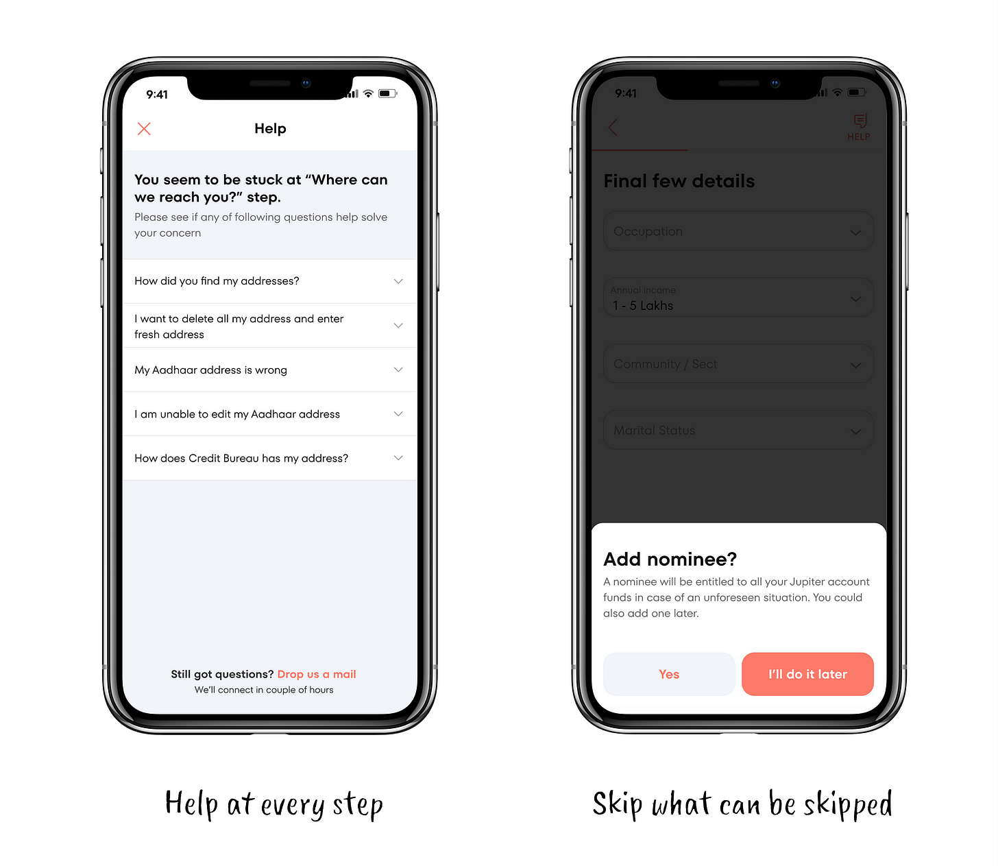
Keep it simple and help all along
Set expectations and be transparent
Understand the context and empathize
Improve perceived performance with delight
The result was 😎
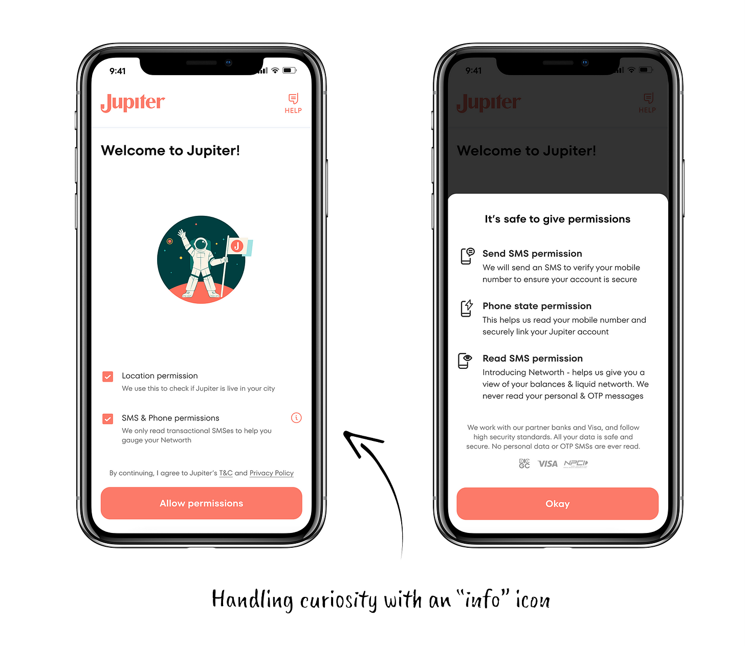
Keeping it simple and friendly
As Clayton Christensen says in Competing Against Luck, people use a product to outsource their work to someone/something reliable. With Jupiter, opening an account is a user’s first step towards financial wellness. We kept the flow simple, smart and helpful — all the way through.
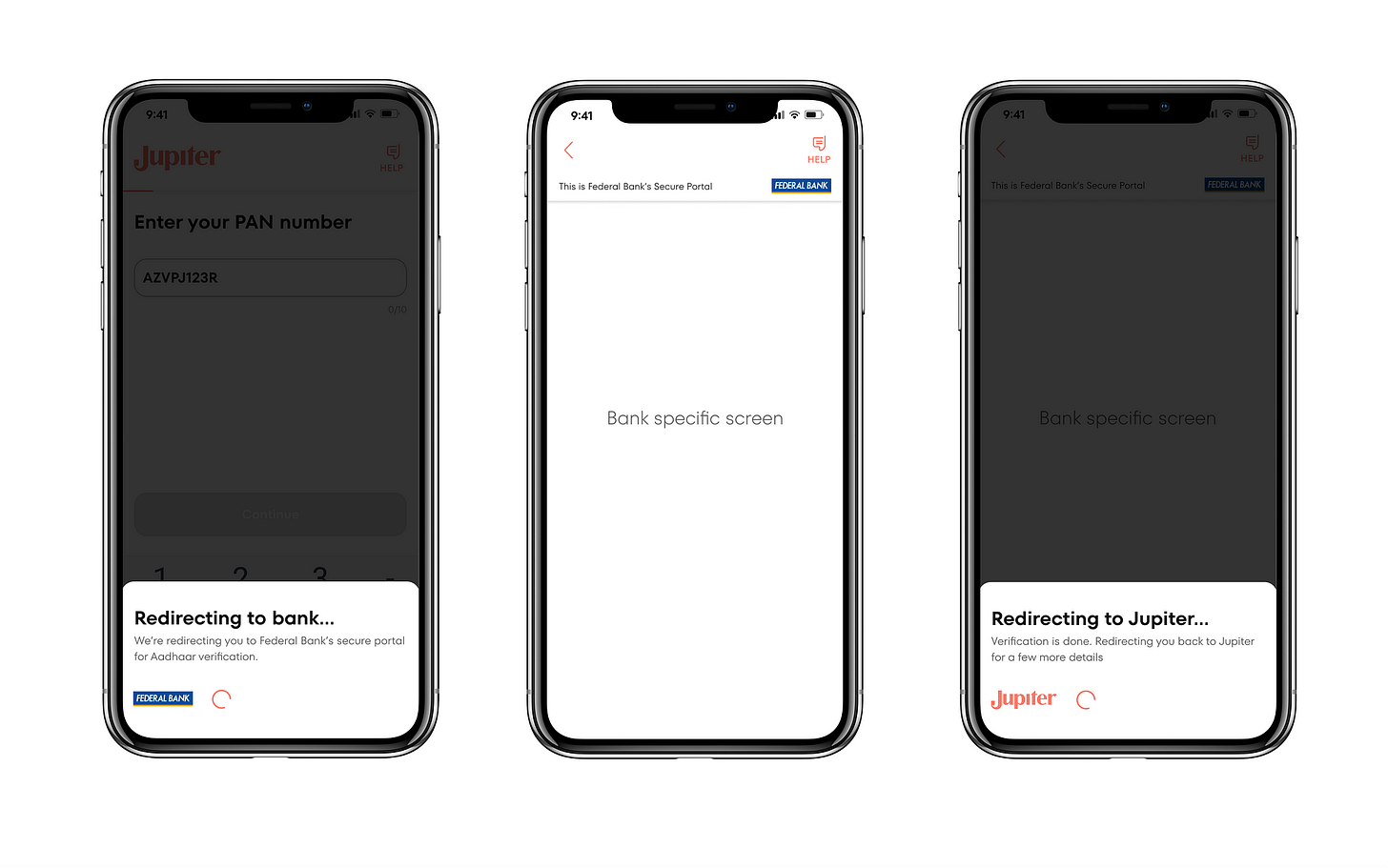
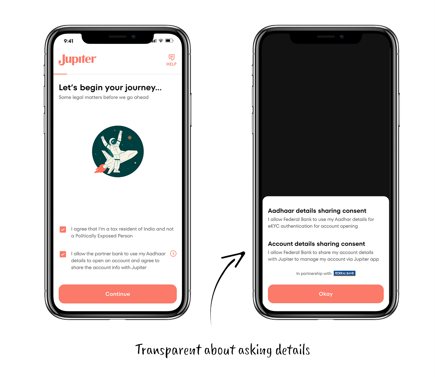
Set expectations and be transparent
In the payments world, you’re often redirected to a common portal (for example, the NPCI screen that asks for your password while making UPI payments). Similarly, the RBI has certain regulations that require every bank to build their own screens to capture sensitive information like Aadhaar, OTP and more. We simulated a simple bottom sheet that communicates change in screens — from Jupiter to Federal Bank — and also acts as a loader.
Understand the context and empathize
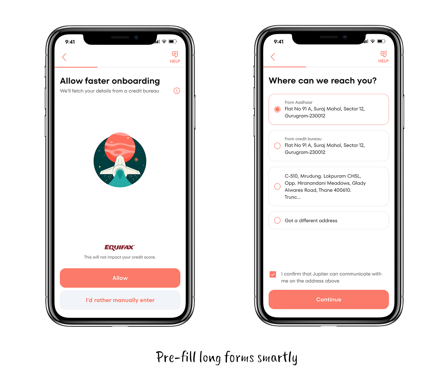
Who hasn’t experienced the pain of filling out long forms on bank websites and apps? You spend ages moving through the dozens of fields, only to hit submit…
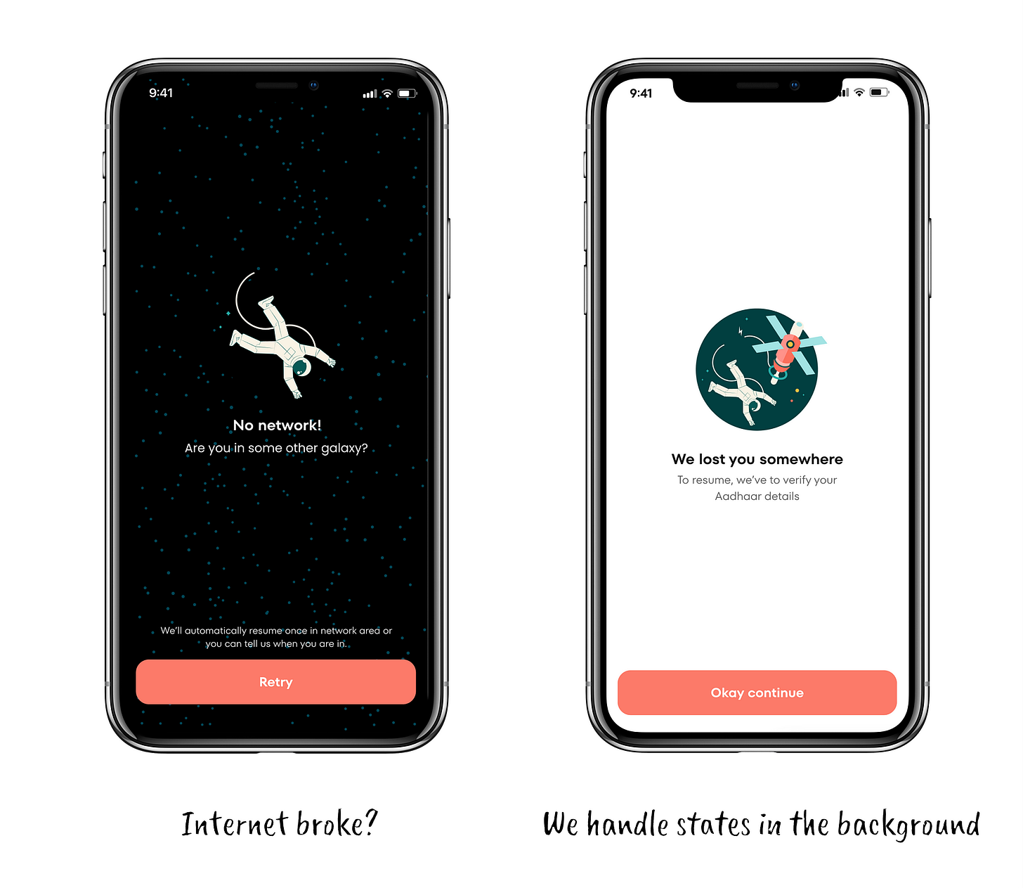
Worry not! Jupiter’s smarter than that. Our tech maintains your session at all times. So if you get a call or your battery dies or you land in a no-network area, we’ve got you covered. We know the context, and help you resume right where you left off from.
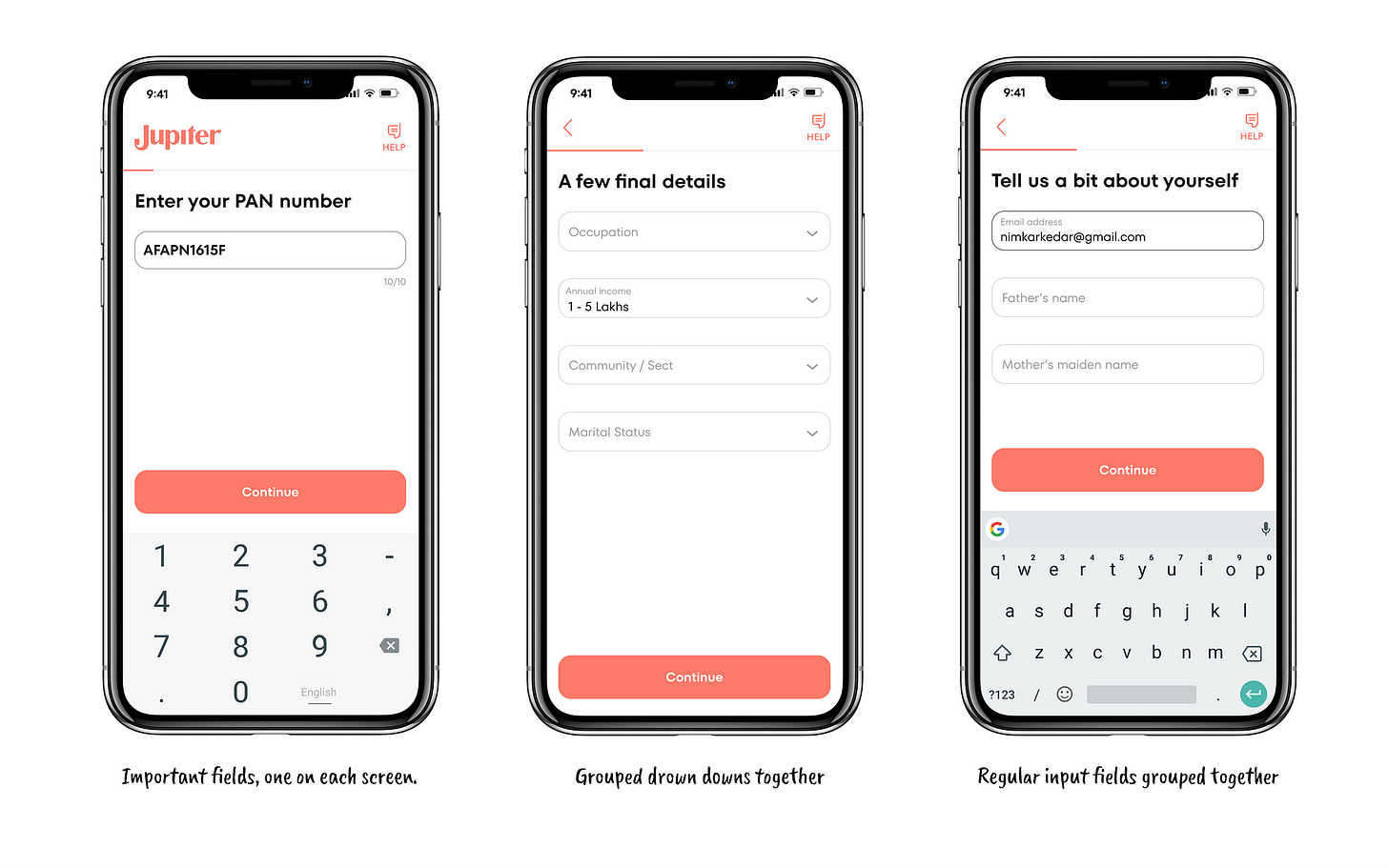
The other cool thing we did was to group information so quick tasks could be completed with similar button movements. For example, selection versus typing. This might sound obvious but, like they say, great design is invisible. The magic’s in the details, and we’re always chasing it.
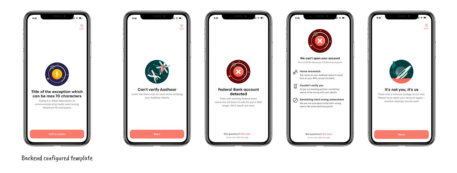
The last act of empathy was the toughest. Our partner bank has 100+ errors that can occur while opening a bank account. Literally. Obviously, we can’t show all of these. Also, more often than not, the top 5% of the problems occur more than 90% of the time. We handled this elegantly by creating templates and keeping them configured in the backend.
We custom-built a few illustrations and messages. For really low frequency but critical errors, exceptions were made modular.
Improve perceived performance
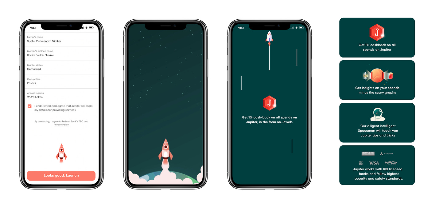
In India, opening a bank account in under 3 minutes is a benchmark. While the time it takes may not be a core metric for design, handling the anxiety is certainly important. Especially when a user is almost done and has, therefore, shown high commitment. This is also the time to educate them about Jupiter’s cool features. We designed a really smart loader to match our space theme.
Here’s all how it all sits together when the user reviews their details and hits “Looks good. Continue”. The video shows one feature. We keep showing more features on the app, depending on how long it takes to open your account.
Download the Jupiter App to see it in action


