[Design nuance] Switcher icon
Cleartrip for past 10 years have always stood for Travel. It’s always tough for any company to break out of it’s positioning & offer new set of products & features. With recently launched Cleartrip Local, we faced similar such situation. The most challenging part while designing local was to fit it in the same app. It was not just adding few more icons in the product line up but inherently positioning Local and Travel as 2 modes. Local had to be at an equal level as Travel.
We gave a deep thought about whether it should be a different app or the same. But of course travel is not as frequent as going for a day outing, so we decided to accommodate local experience in the same and now you don’t have to download another app. If the app has to operate in 2 modes then not only we have to establish this conceptually, but also visually creating levels.
We set out with following goals
Same app, 2 modes
Switching between the 2 modes to be made super simple and accessible
Educate people about Travel & Local modes every time the Cleartrip app is launched
To meet these goals we did a number of iterations, one leading to another. We would like to show you the journey of how the interface evolved.
Iteration # 1 — Extending tab bar
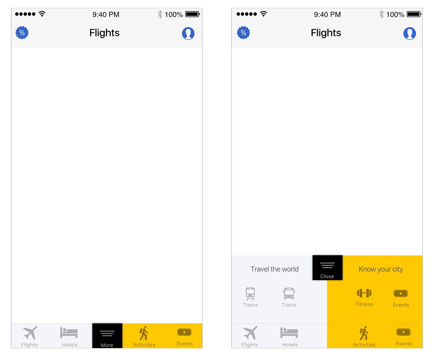
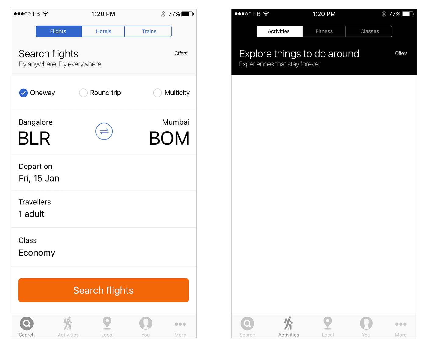
Considering one very old post, there was no debate about showing the navigation first. Get the user to do his frequent task without any taps. So the first and obvious iteration was to retain the tab bar and add a “more” button which expands the navigation to show more options. Not even remotely acceptable.
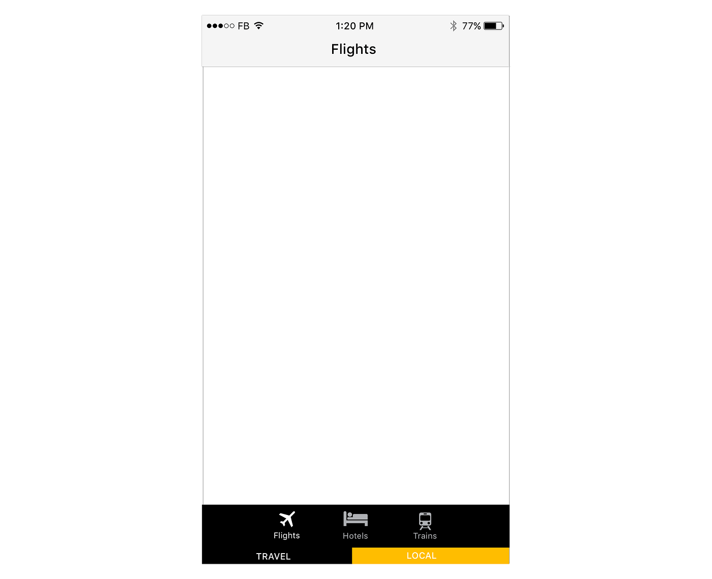
Iteration # 2 — Color coding Tavel & Local
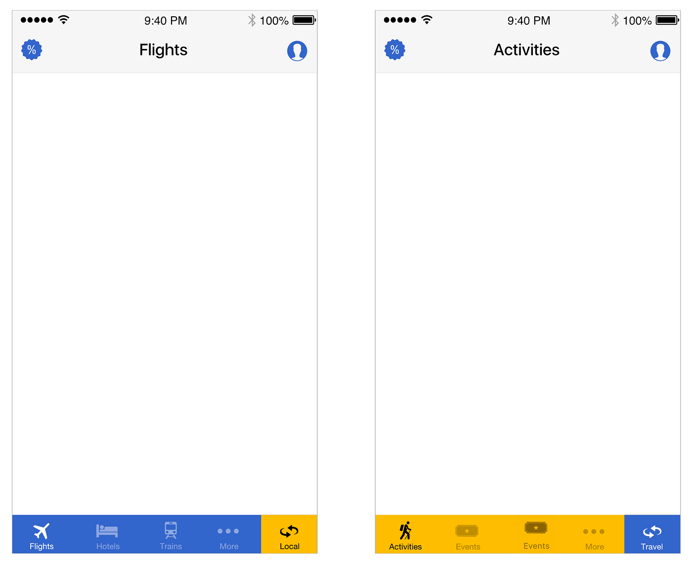
Color code travel and local. Blue stands for travel and yellow stands for local. Really? I asked my self and gave it a shot but was not working. Mainly because it’s too tough for user to first associate with colors and then to identify the number of products within. So rejected.
Iteration # 3 — Creating visual seperation
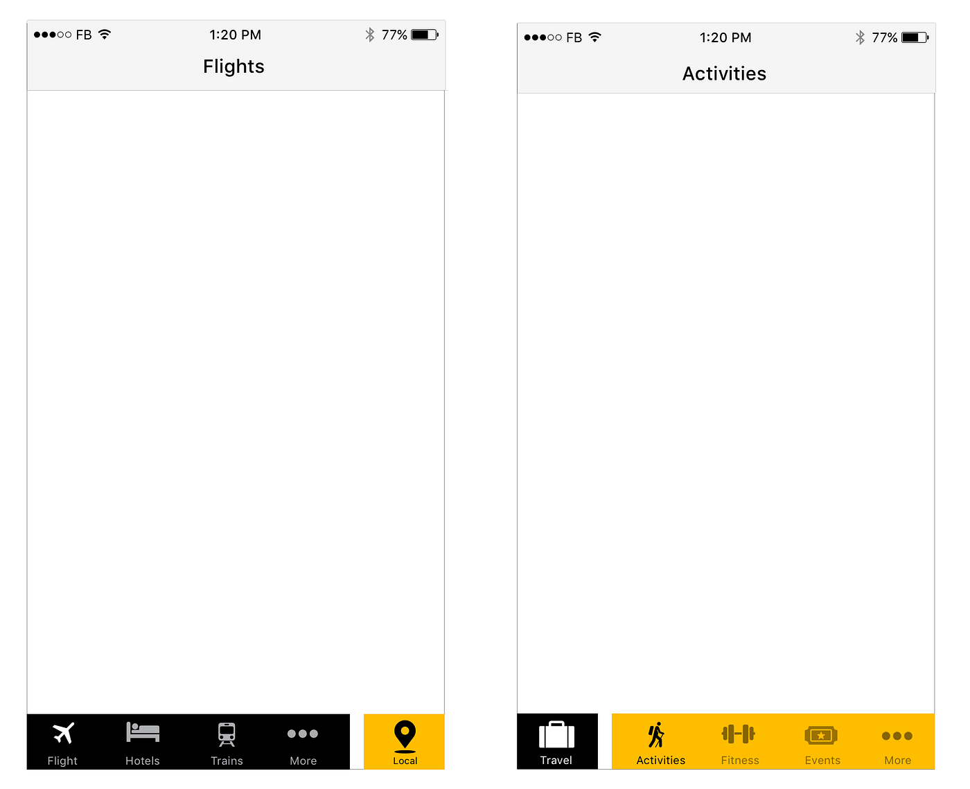
In iteration # 2, I felt there is still scope to explore further. May be the colors are not too easy on the eye and needs some learning curve. So tried another approach with black and yellow, creating a differentiator to establish sections. Still not convinced.
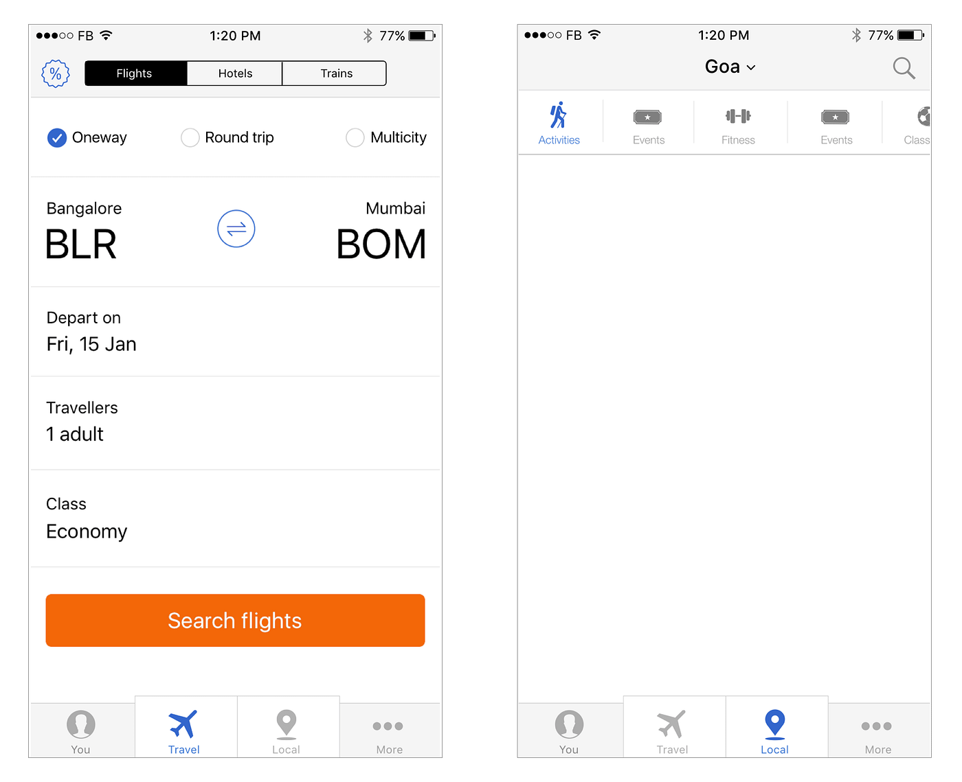
Iteration # 4 — Flattening Travel and Local
Discarded the entire thought and looked at it with a fresh perspective. A lot of people in the design team were convinced with the following approach. We just have 5 main tabs in the tab bar. Search, Travel, Local, You and more. And then within each tab we have segmented controls to show individual products. I know it’s not a regular case, but if someone had to go from Hotel details to Activity details, they had to tap some 8 times. So this was definitely out.
Iteration # 5 — Creating 2 prominent modes
Lets merge last 2 iterations and see if we can come up with some other variation. Not happening again.
Iteration # 6 — Explore posibilities
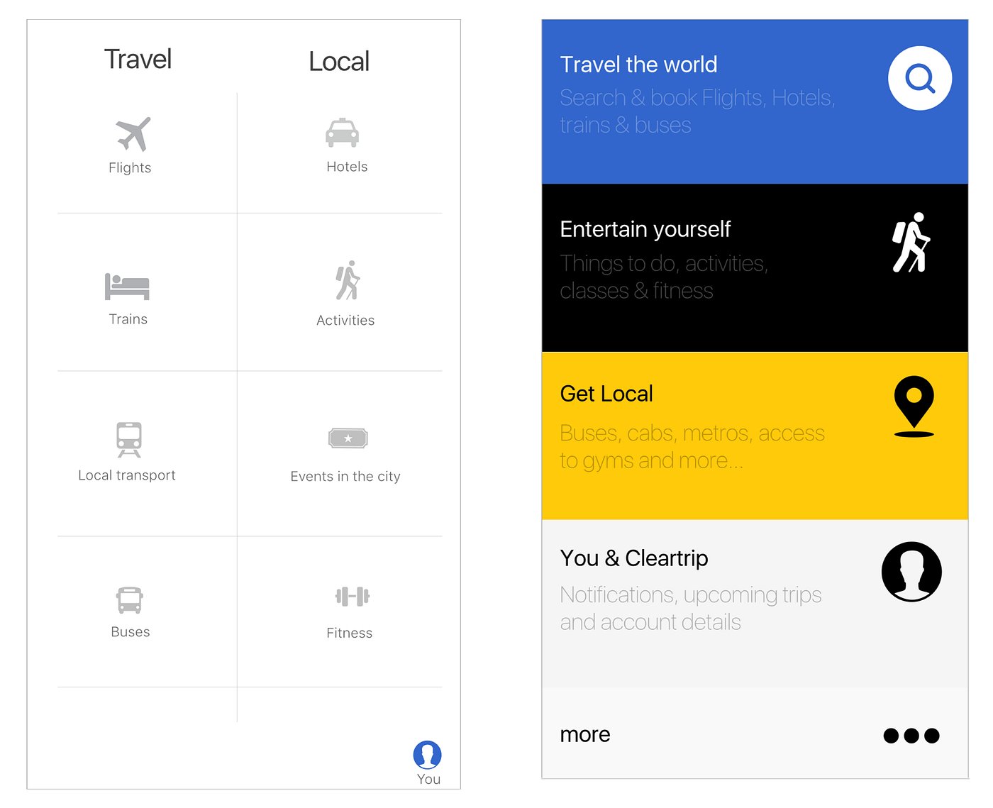
By this time our anxiety levels were on there peak. We decided to go all out. Not linear but explore all possible directions.
Iteration # 7 — Stick to basics
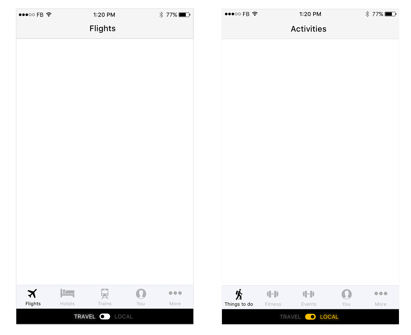
After exploring various possibilities, we were quite convinced that lets not reinvent the wheel. The most convincing of all the approaches which we tried was iteration # 5 with 2 main controls to switch mode. A bit more experimentation on that lead to a series of variations.
Iteration # 8 — Break through
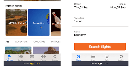
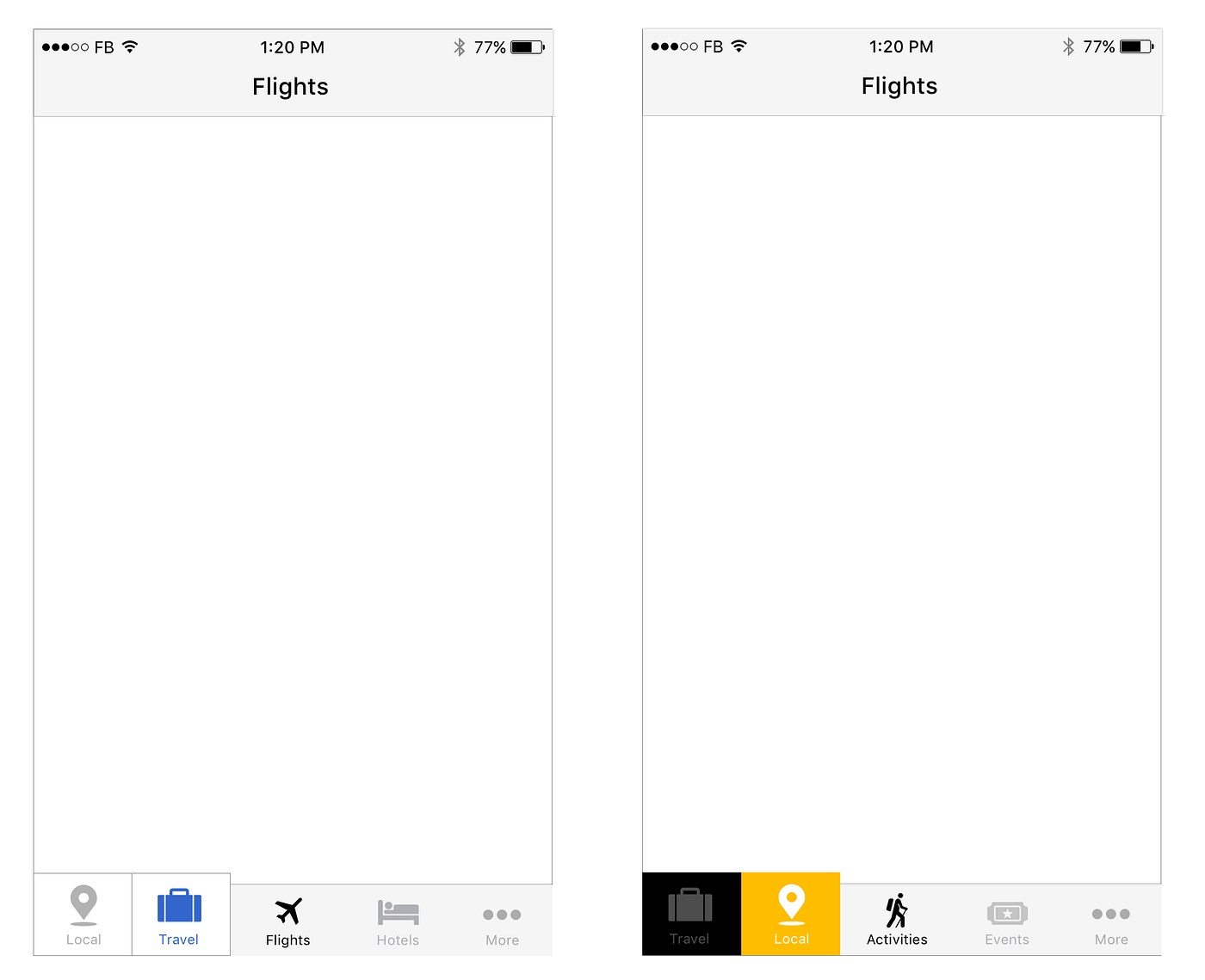
The idea echoed at the most fundamental level and this was it. After sleeping over this concept and referring to few other well designed apps, we strongly felt that something on these lines will work perfectly fine and won’t disturb the user experience.
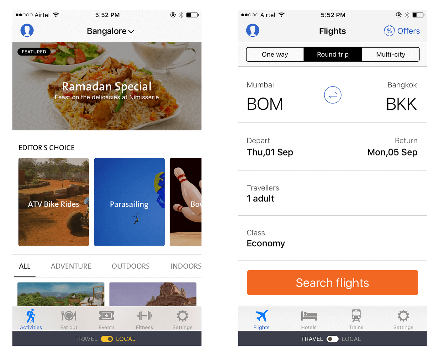
Iteration # 9 — Almost there
The black switcher bar was conflicting with the black body of the phone and was not visible. So we made it gray to have a better contrast. And this is how it has turned.
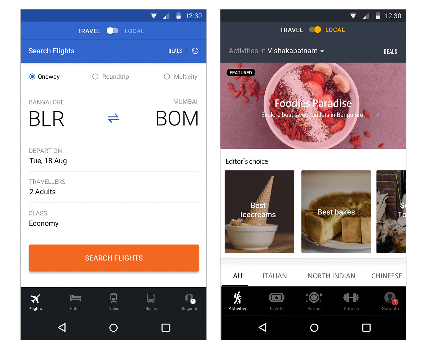
While all these experiments were happening, Google also released a component in the material design which included the bottom tab bar. Few days back we shared design nuances of Android navigation. Since Android has these hardware buttons in the bottom, it was tough to put the toggle bar in the bottom which can get tapped accidentally. Also users is in local mode will rarely switch to other mode unless they have travel plans. Assuming this, we placed the switcher icon on top in Android.
In the coming days we are further optimising the navigation for better experience. Meanwhile give Local a spin and stay tuned for more updates.
Originally published at blog.cleartrip.com on August 9, 2016.


