[Redesigned] A cleaner, leaner, more useful travel confirmation page
Two days ago, we shared some details about the redesign that gave us a sexier, smarter, simpler travel booking process. We’ve had some great feedback from the community and some of us were so taken by the new design, that:
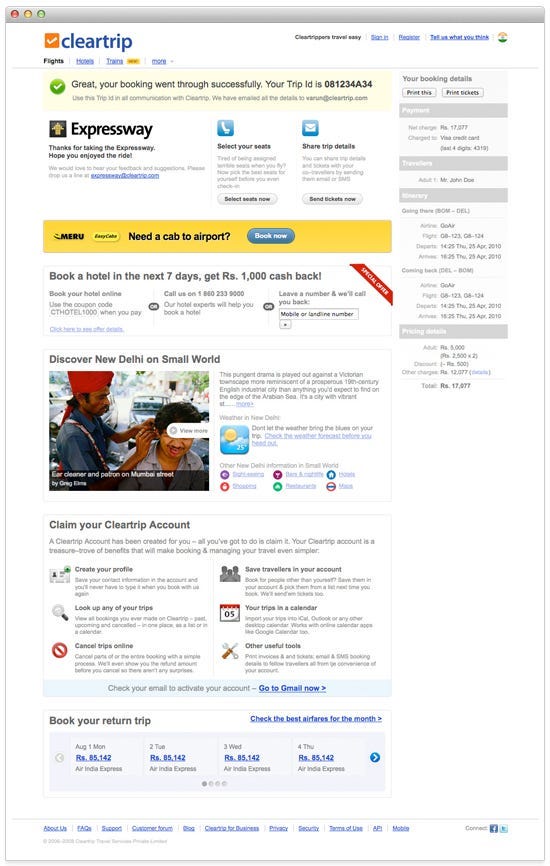
Along with the redesign of our booking process, we also redesigned our booking confirmation screens. Here’s what the old confirmation screen looked like:
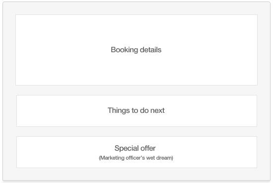
Almost hurts our eyes to look at it now (isn’t 20–20 hindsight great?). The old confirmation page had just become a dumping ground with us trying to help you with anything and everything; trying to sell you everything else we possibly could. This time around, we wanted to avoid that approach and craft a design that would be immune to the future buildup of clutter. We started off by chunking all of the content on the page into three groups — your booking details, free and easy add-ons for the trip you just booked and one special offer just for you.
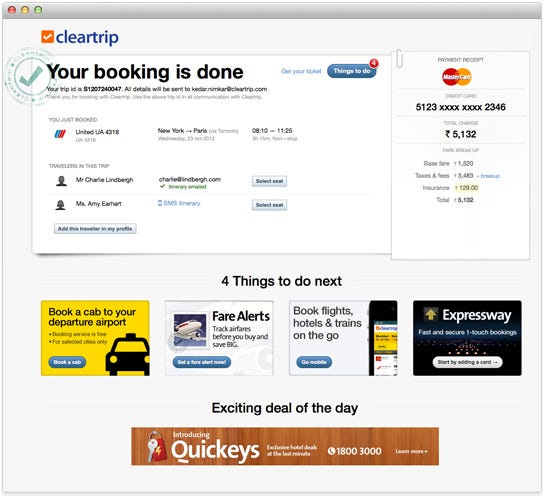
Taking off from that skeleton layout, here’s the newly designed booking page — cleaner, lighter and so much crisper:
For the display of your booking details, we went with a boarding pass metaphor. We also added a few handy buttons to the details to let you SMS or email the booking details to fellow travellers or to select seats for your flight right away.
The second block of the page helps you focus on some things you may want to add to the booking you’ve just made. This block contains a 1×4 grid with banners that let you easily book a flight to the airport or set a Fare Alert for your return trip and more.
The third and final block contains a single “Deal of the Day” banner, where we showcase just one handpicked deal.
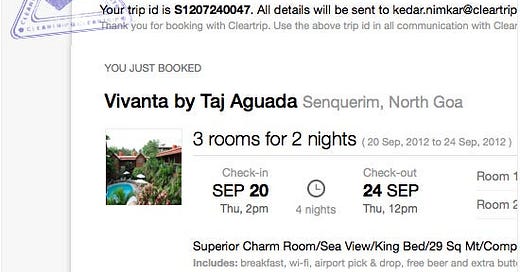
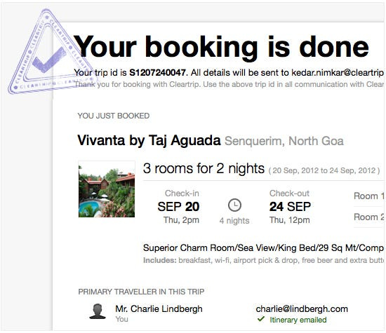
The booking details displayed for hotel bookings are obviously different, here’s what that looks like:
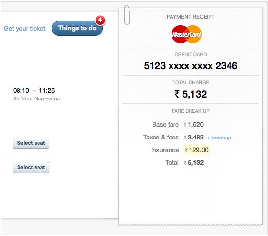
Each booking confirmation page now contains a handy receipt so you can clearly see the total cost for your trip and how that cost is broken down.
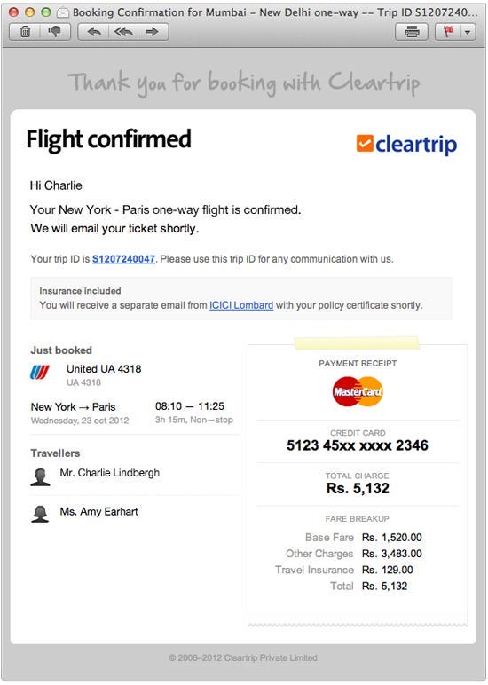
Finally, we also redesigned all of the post-booking email messages you receive from us. Here’s a sample email for a successful flight booking:
Your travel booking means the world to us and we wanted that to show in the design of our confirmation screens and other parts of the post-booking experience.
Originally published at blog.cleartrip.com on July 26, 2012.


